From logo and icons to a modular type system for Muse Group
Muse Group develops music software used by millions—Ultimate Guitar, MuseScore, Audacity, Muse Class and Muse Hub. When Collins reframed the brand around “creative fluency,” they invited Contrast Foundry to give that idea a typographic voice. The concept for the typeface was created by Indgila Samad Ali, design director at Collins, working together with Rebeka Arce, as part of the agency’s broader brand system. Building on this concept, we refined the direction and drew the letterforms that became Muse Display.
Alongside them, something equally bold and condensed, but more neutral was needed. Indgila tested numerous typefaces, but ultimately settled on CoFo Kak Medium from our collection. The appropriate weight, proportions, tall lowercase letters, compact descenders, round dots, and overall softness influenced the decision. However, we made some noticeable changes to CoFo Kak Medium, dictated by the overarching concept, and it became Muse Display Harmony (read more below). In the Muse Display typographical system, Harmony serves as the primary typeface for headlines.
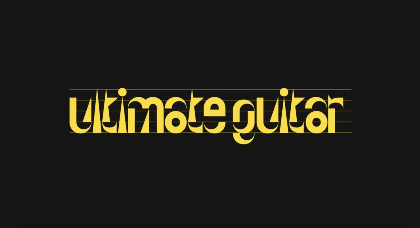
The most important thing for us was ensuring that the text set in multiple styles looked consistent in terms of weight. So, we designed the stems in the display styles and Muse Display Harmony with different widths! In Harmony, the uppercase stems are slightly thicker than the lowercase, but in the display styles, both upper and lowercase have equal stem widths.